Case study 02 / Oil and gas services
GEE Expert Limited
A welding and fabrication company serving oil and gas operators in Port Harcourt, with more than a hundred delivered projects and nothing online to show for any of them. The hard part was never the website. It was deciding what an industrial company should look like when its existing identity was green and red.

- Role
- Brand direction, logo, copy, build, deployment
- Timeline
- August 2026
- Stack
- Next.js static export, TypeScript, Tailwind CSS v4, Cloudflare Pages
- Status
- Live
The problem
GEE Expert Limited does welding and fabrication, corrosion control and maintenance, logistics, oil tools and electrical materials for operators in the Nigerian oil and gas sector. More than a hundred delivered projects. Real equipment, real clients, real capability.
Online, none of it existed.
The buyer problem was specific. In that sector a procurement officer or project manager checks a vendor before the first call. If nothing comes up, or what comes up looks amateur, the vendor is off the shortlist before anyone has spoken. Their capability was never in question. Their credibility at first contact was.
The decisions
Changed the brand direction rather than dressing up the old one.
The existing identity was green and red. I presented two directions and recommended the one I called Elevated Industrial: a steel and charcoal base with heritage green as the accent. Rejected: keeping green and red, which reads as local rather than international and which fights the heavy dark photography an industrial site needs. The client chose the new direction.
Rebuilt the logo, and took the service list out of it.
Three options presented, client chose the globe emblem with the company name and no tagline. Rejected: keeping the list of services inside the logo, which is common in that market and which expires the moment the company adds a service line. They already have a logistics division, so it would have expired immediately.
Ten pages and six unique designs, not a one page site.
Five separate service pages rather than one services section. Rejected the single page approach for a specific reason: a procurement officer searching for corrosion control in Port Harcourt needs to land on a page about corrosion control, not on an anchor link partway down a homepage.
One of five separate service pages. Every photograph is the client's own delivered equipment. Presented the sister company as a division.
PRIME GEE LOGISTICS LTD is a separately registered company. Representing it as the logistics division rather than a separate brand made the parent company look larger without claiming anything untrue.
Real photographs of delivered work, not stock imagery.
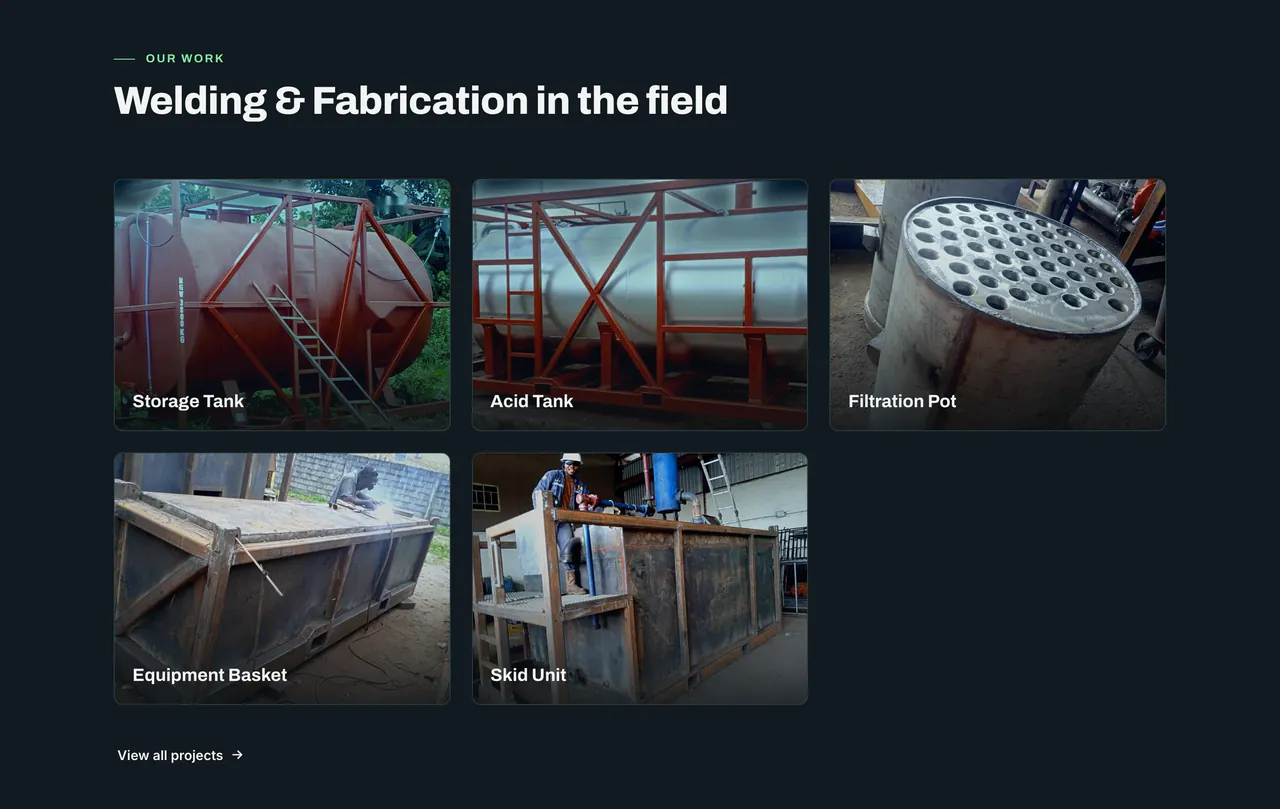
The client sent eleven photographs of finished equipment with their actual names: acid tank, equipment basket, filtration pots, flowback tanks, high pressure pump, manifold, skid, slowing tank, storage tank. Those became the projects page. Rejected: stock industrial photography, which every competitor uses and which the people they are selling to recognise on sight.

What did not work
The hero image is AI generated, a cinematic shot of a welder on a flanged pipe, because the client had no photography of their own crew at work. It is the weakest decision on that site. It was also, for a while, a performance problem: the original JPEG was 287KB and pushed Largest Contentful Paint to 3.5 seconds. I built a build time pipeline that generates AVIF and WebP variants at five widths, which took the file the browser actually fetches on mobile down to 24KB and LCP to 2.3 seconds. That fixed the speed. It did not fix the photograph, and real images of their own team remain first on the list of recommended improvements.
The copy also needed a full editing pass at the end to strip out phrasing that read as machine written. That should have been a rule from the first sentence rather than a cleanup round at the end, and on this site it is now.
The outcome
Measured 23 September 2026 via PageSpeed Insights, mobile, emulated Moto G Power over slow 4G throttling. Median of four runs.
| Performance | 99 |
|---|---|
| Accessibility | 100 |
| Best Practices | 100 |
| SEO | 100 |
| Agentic Browsing | 2 of 2 |
| First Contentful Paint | 0.9 s |
| Speed Index | 0.9 s |
| Total Blocking Time | 10 ms |
| Cumulative Layout Shift | 0 |
| Largest Contentful Paint | 2.3 s |
Zero layout shift and zero blocking time say the build itself is clean. The Largest Contentful Paint figure is the hero image described above, and it is the honest weak point rather than something to explain away.
No business results yet. The client is settling internal matters before any marketing push, so there is nothing real to report on enquiries or traffic and I am not going to invent any. This section gets updated when there is something true to put in it.
What I would do differently
Insisted on a photography session before starting the build rather than accepting that none existed. The hero image is the one thing on that site I would change, and it was a decision made under a seven day deadline rather than one I would defend on its merits.
In the client's words
“We engaged Chukwuma to build our corporate website, and what we got back was more than a website. He studied our business properly, our welding and fabrication, corrosion control, logistics and supply lines, and then came back with a brand direction that made us look like the serious international operator we are. He rebuilt our logo into something clean and modern, and we approved it without hesitation. The site was delivered on schedule, works well on phones, which matters because most of our clients open it in the field, and it has genuinely improved how people perceive our company on first contact. He is professional, he communicates clearly, and he takes ownership of the outcome. I recommend him without reservation.”